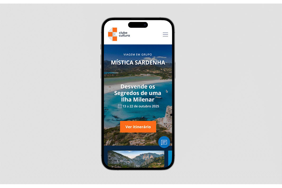
Travel Platform Clube Cultura
Defined the brand identity and translated user research into an accessible travel platform for seniors across web and mobile, reducing friction and improving the booking experience.
PROJECT SCOPE
Brand Identity, UX Research, UX/UI Design, Responsive Website, Mobile App
MY ROLE
Lead UX/UI + brand identity
PROJECT DURATION
100 hours
THE PROBLEM
Many travel platforms are designed for digitally confident users, making them difficult to navigate for seniors. Small text, unclear flows, and information overload increase cognitive load and discourage users from completing bookings.
The challenge was to design a clear and accessible platform that reduces friction and enables seniors to explore and book cultural experiences with confidence across web and mobile.
RESEARCH OBJECTIVES
Methods
> 39 User Interviews
> Persona Development
> Moodboards
> Information Architecture
> Wireframing
> User Journey Mapping
Participants
> Adults aged 60+
> Interested in cultural
and guided travel
> Mixed levels of digital literacy
Through user interviews and surveys, I wanted to:
> Understand how seniors search and book travel experiences
> Identify usability barriers in existing travel platforms
> Evaluate confidence levels when completing online bookings
> Understand accessibility needs related to readability and navigation
> Discover emotional concerns related to online payments
> Define behaviours across desktop and mobile usage

TARGET USERS
I found that both confident and less confident users appreciated clear feedback during the booking process, but their needs differed. Experienced users valued efficiency, while less experienced users relied on reassurance to feel confident completing their bookings.
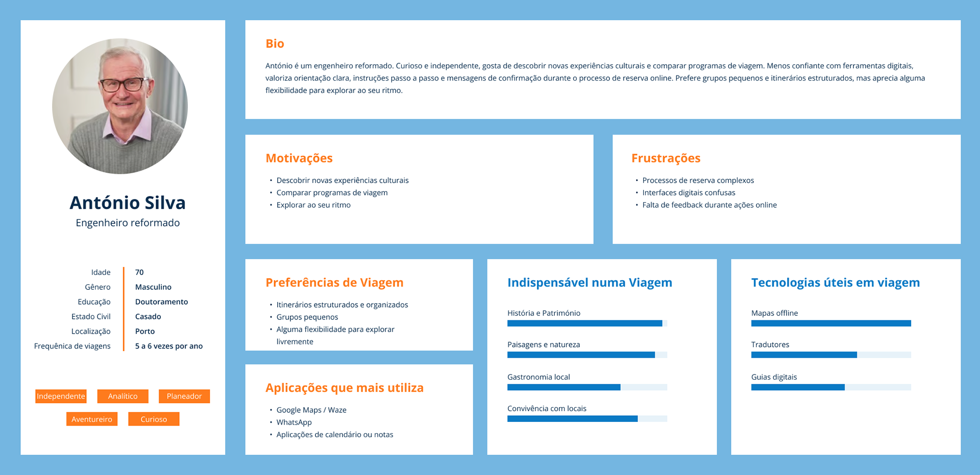
Persona #1: The Experienced Explorer
> Value flexibility to discover unique details.
> Join small groups for social experiences but don’t rely on constant digital support.
> Prefer autonomy when using apps, navigating with maps and digital itineraries.
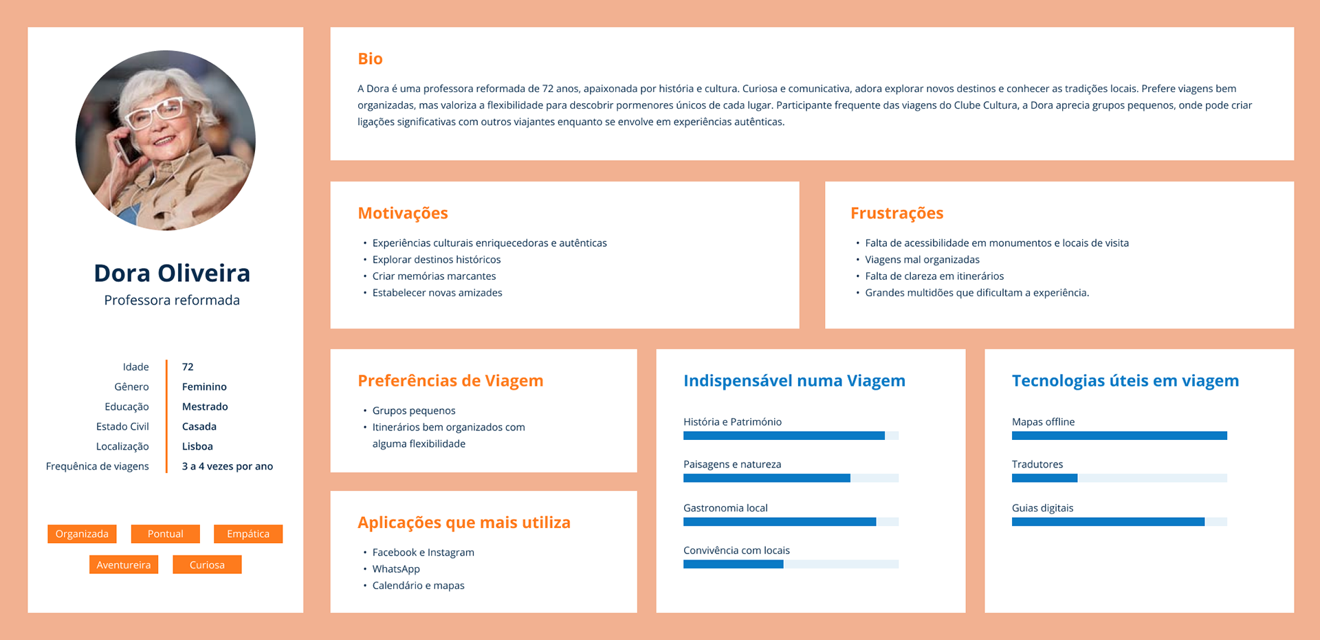
Persona #2: The Supported Traveller
> Need clear instructions and continuous feedback during online bookings.
Depend on messages, alerts, and confirmations to gain confidence.
> Biggest challenge is navigating complex platforms without hesitation.
> Prefer structured itineraries and ongoing support throughout the trip.
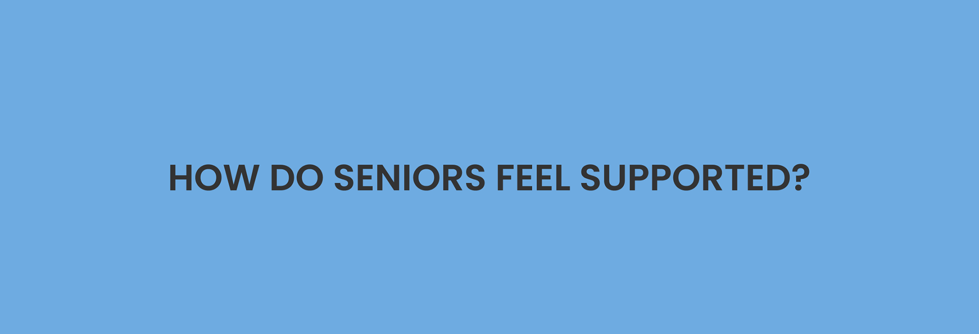
While the users’ reasons may differ, their needs remain the same: to feel supported and confident while booking and enjoying their trips.
This led me to consider:
IDEATION
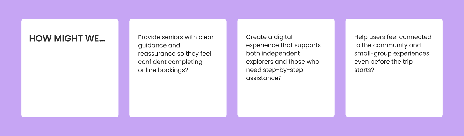
How can I guide seniors through booking in a way that feels simple but engaging?
How can I provide reassurance without overwhelming them with notifications?
How can I integrate the digital support with their preferred ways of exploring cultural experiences?
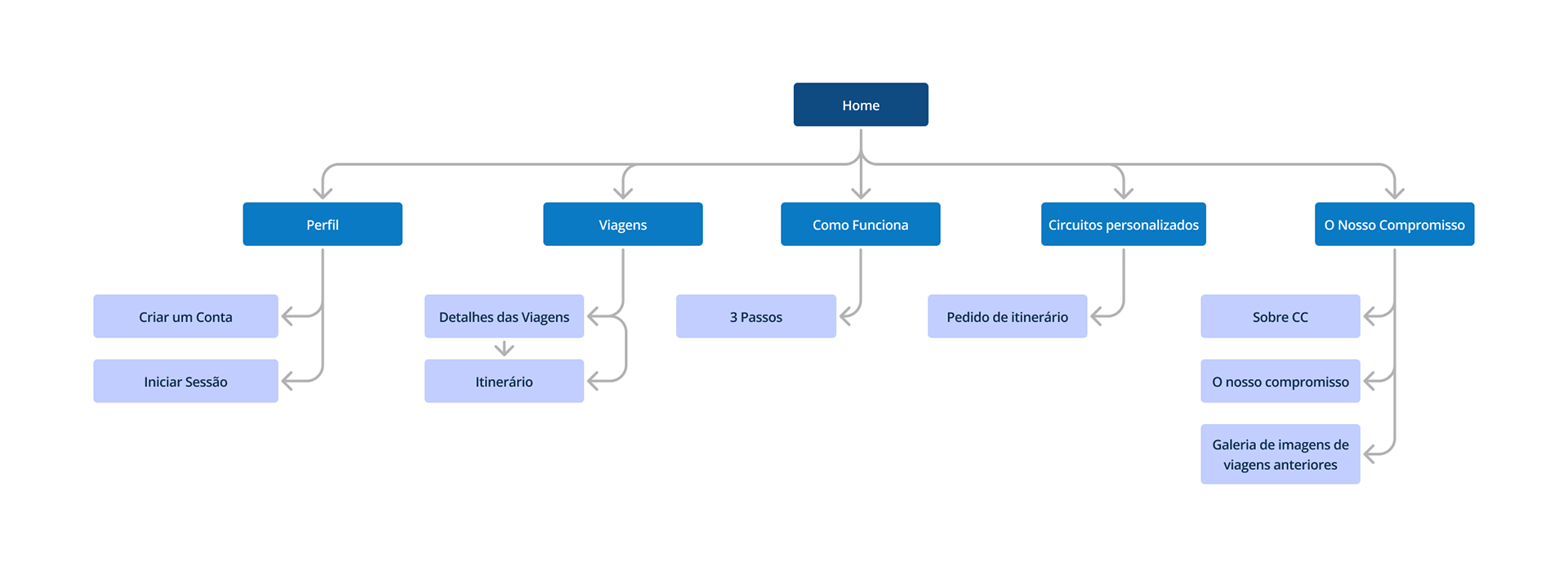
Focused sitemap with simple navigation
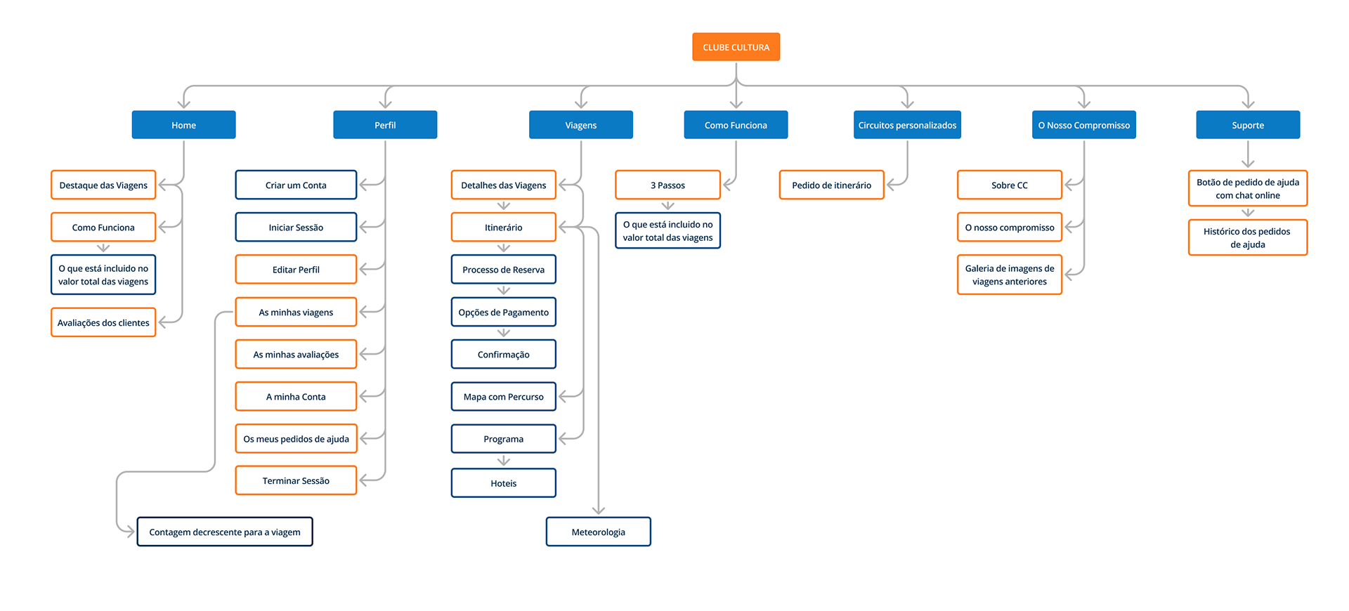
Information Architecture
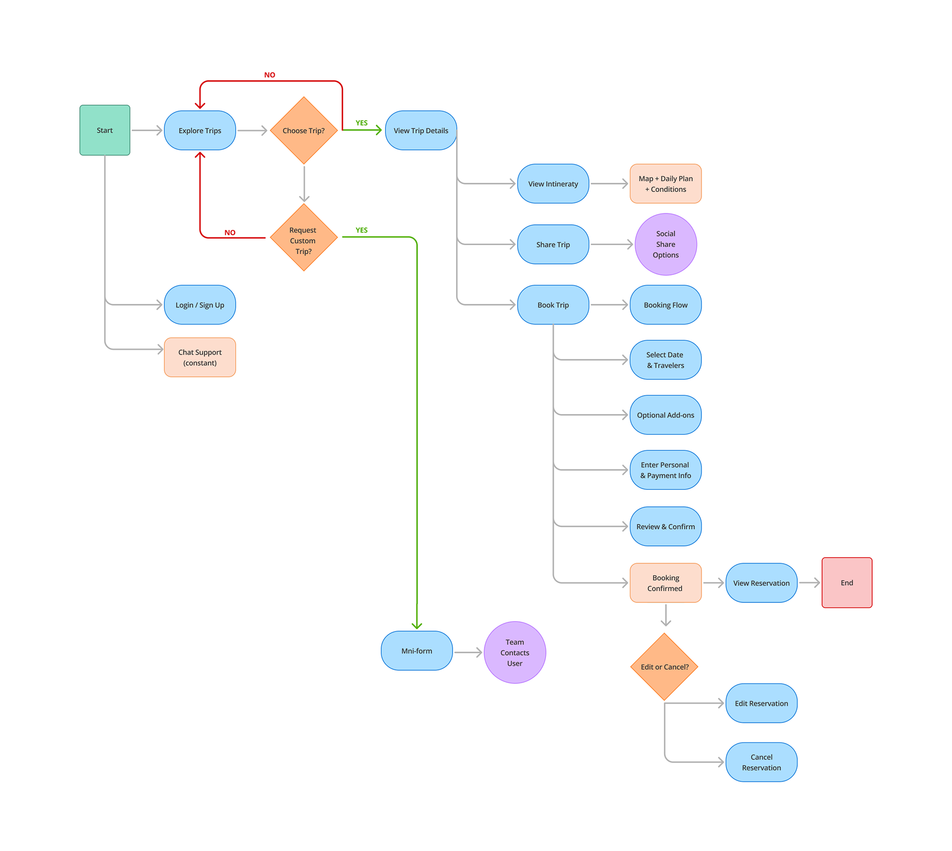
User flow for booking a trip
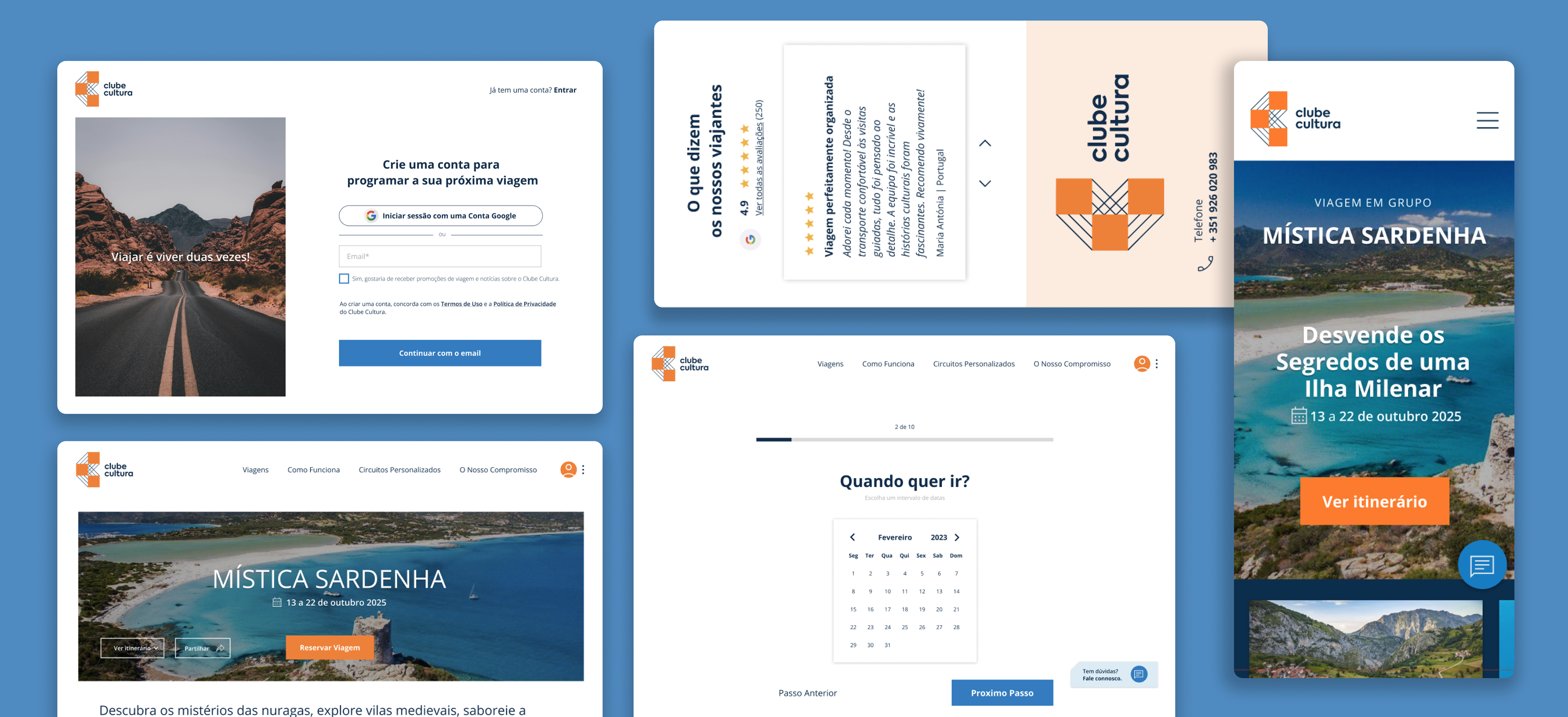
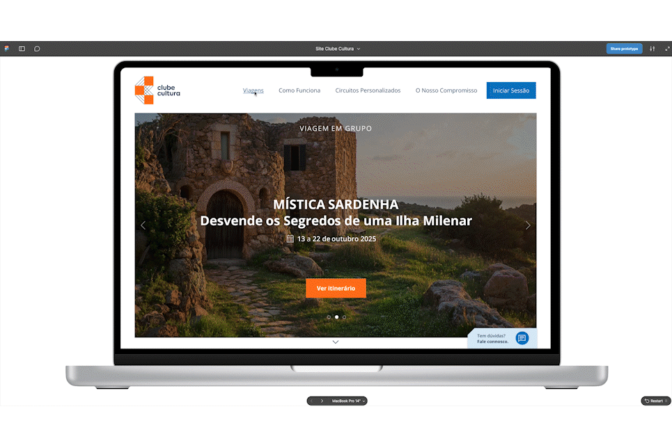
BUILDING THE BRAND
I wanted the logo to feel simple, structured, and connected. As "Clube Cultura" is built around shared experiences and meaningful journeys, the symbol was designed to reflect connection between people, places, and moments.
The logo is formed by three connected squares that create the letter “C”. Each square represents a destination or cultural experience, while the connecting lines symbolize travel routes and the relationships formed along the journey.
The geometric shapes were chosen to communicate clarity and organization — qualities that are especially important for senior users who value structure, trust, and easy-to-understand visuals.
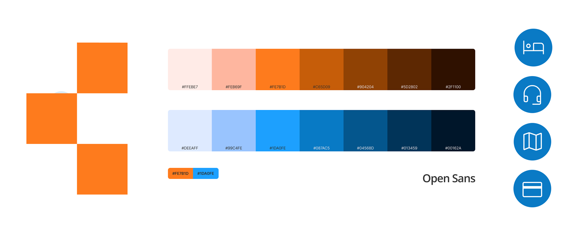
Visual Language
I wanted the visual language to feel welcoming, calm, and easy to navigate. Colors and shapes were selected to create a sense of trust and clarity, helping users feel confident while exploring trips and making decisions.
The use of simple geometric elements reinforces consistency across the brand, creating a visual system that feels familiar and predictable throughout the digital experience.
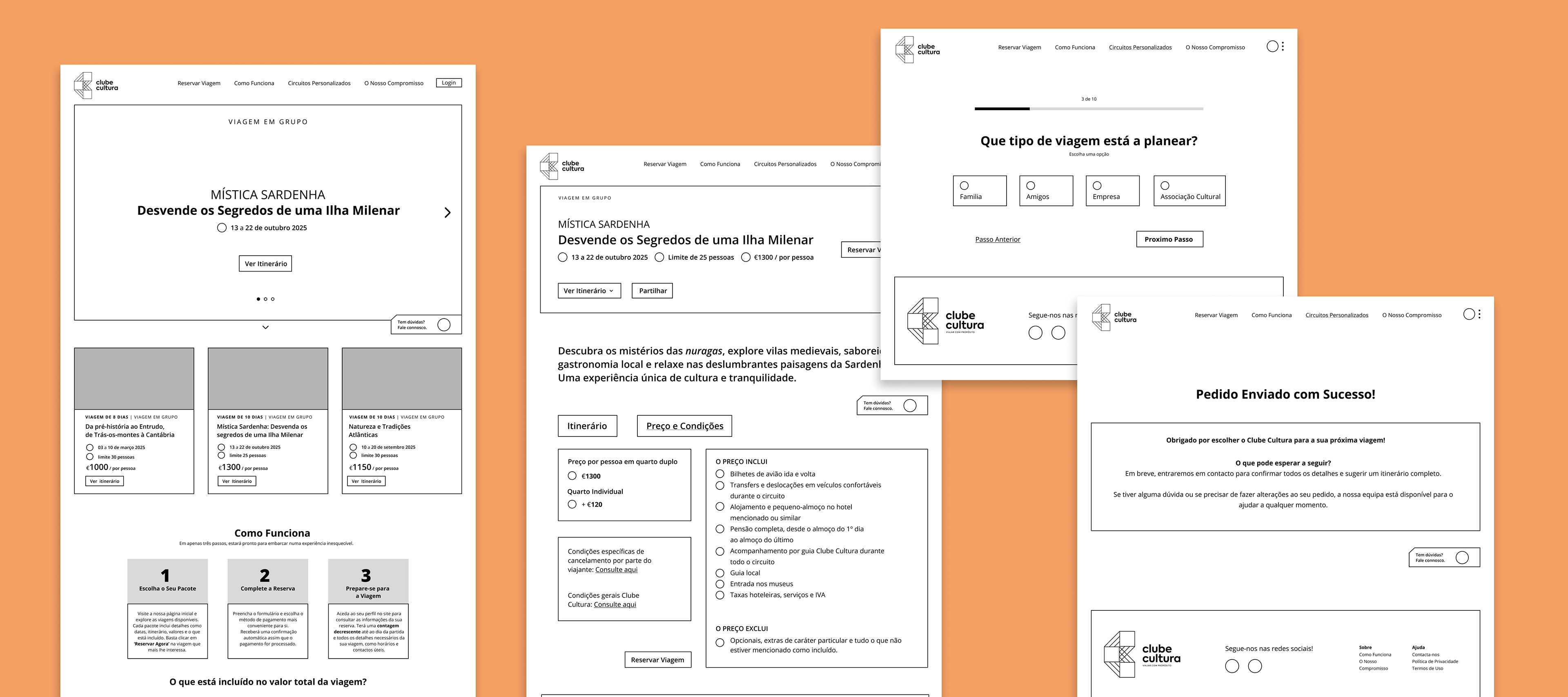
Low-fidelity wireframes
Wireframes were created to organize content, test layouts, and ensure clear navigation before moving into visual design.
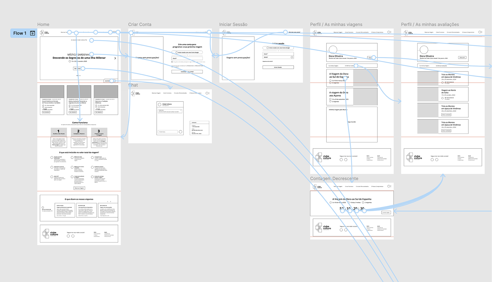
Screen Flow Validation
To validate navigation logic, I connected all wireframes into a complete screen flow, ensuring users could move through the booking journey in a clear and intuitive way.
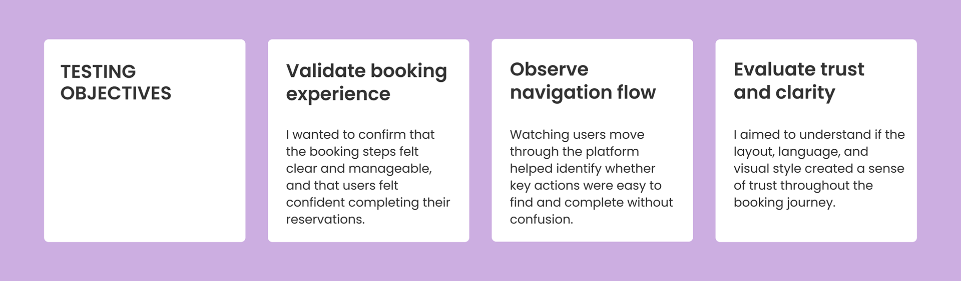
usability results
Users responded positively to the structured layout and guided booking steps. Most were able to explore trips and understand itineraries without confusion.
Some hesitation appeared when reading detailed information, reinforcing the importance of clear hierarchy and simplified content.
iterations + refinement
While testing the booking and itinerary flow, users showed similar hesitation when reviewing detailed information and moving between steps. This led me to implement a few key improvements:
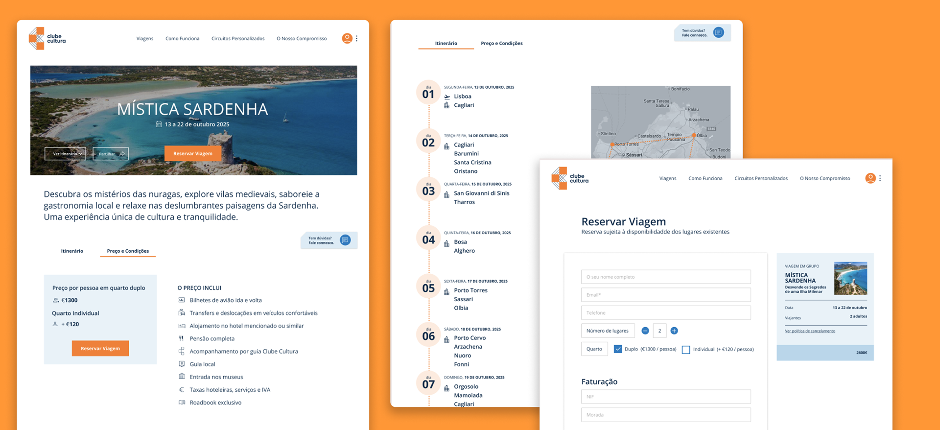
Adding clearer guidance to booking steps
Some users hesitated when entering personal details and reviewing payment information. Even though they eventually completed the process, short helper texts were added to clarify what information was required at each step.
Simplifying itinerary structure
Users appreciated the daily itinerary view but found some sections visually dense. I reorganized the layout into clearer daily blocks, improving readability and making it easier to scan activities and locations.
Strengthening visual hierarchy
During testing, users spent extra time searching for key actions such as booking confirmation and next steps. Primary buttons were made more prominent, and spacing was adjusted to guide attention toward important actions.
finale prototype