conta lá - landing page DESIGN
Designing a media brand's digital home in under 20 hours.
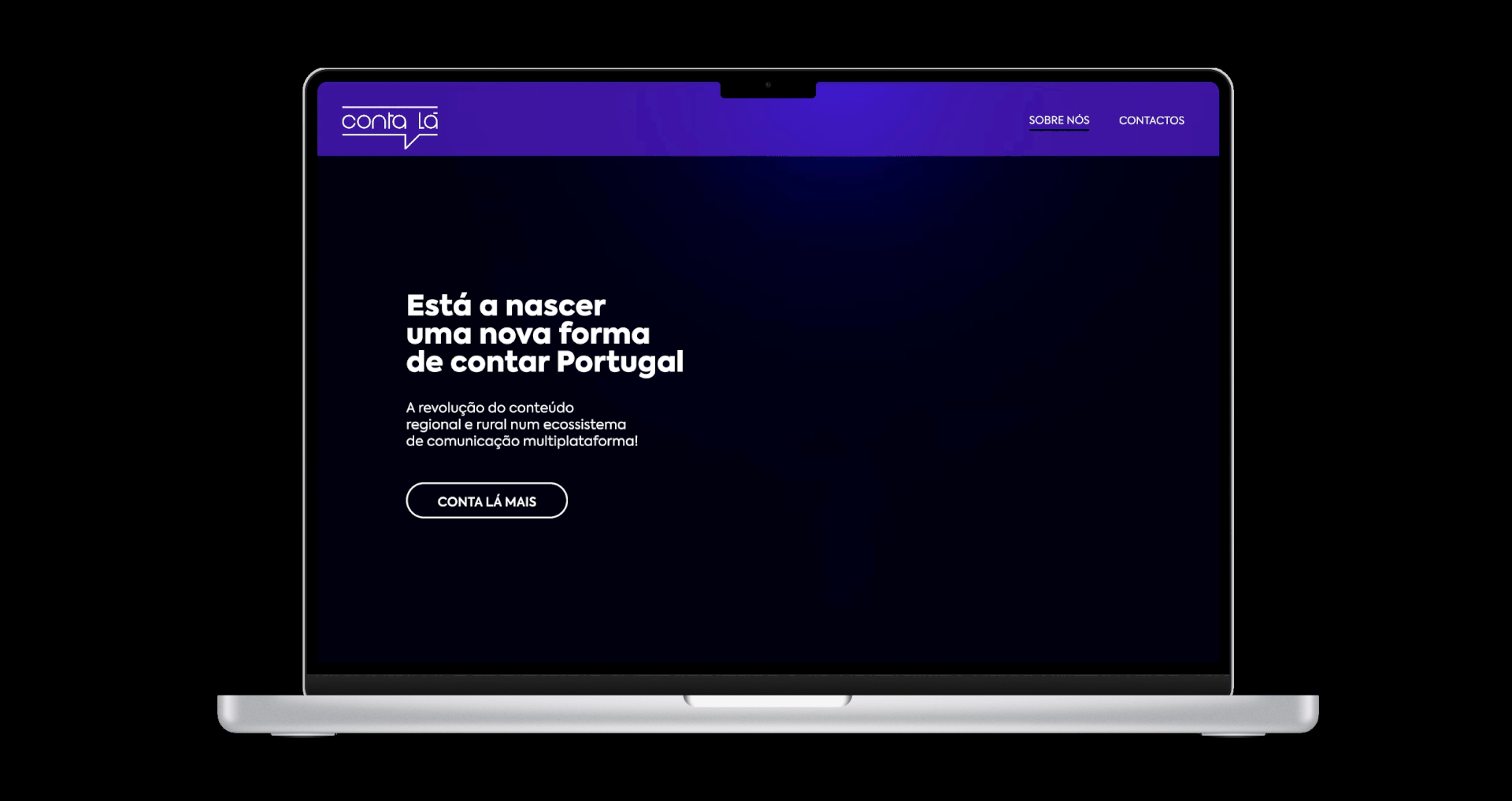
Conta Lá - Portuguese digital media platform
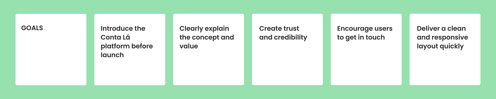
PROJECT SCOPE
Fully functional Landing page
MY ROLE
UX/UI Designer — Solo project Visual Design · Prototyping · Delivery · Developer Handoff & QA
Short delivery (urgent launch phase)
CONSTRAINTS
No time for extended research, rapid decision-making required throughout
Overview
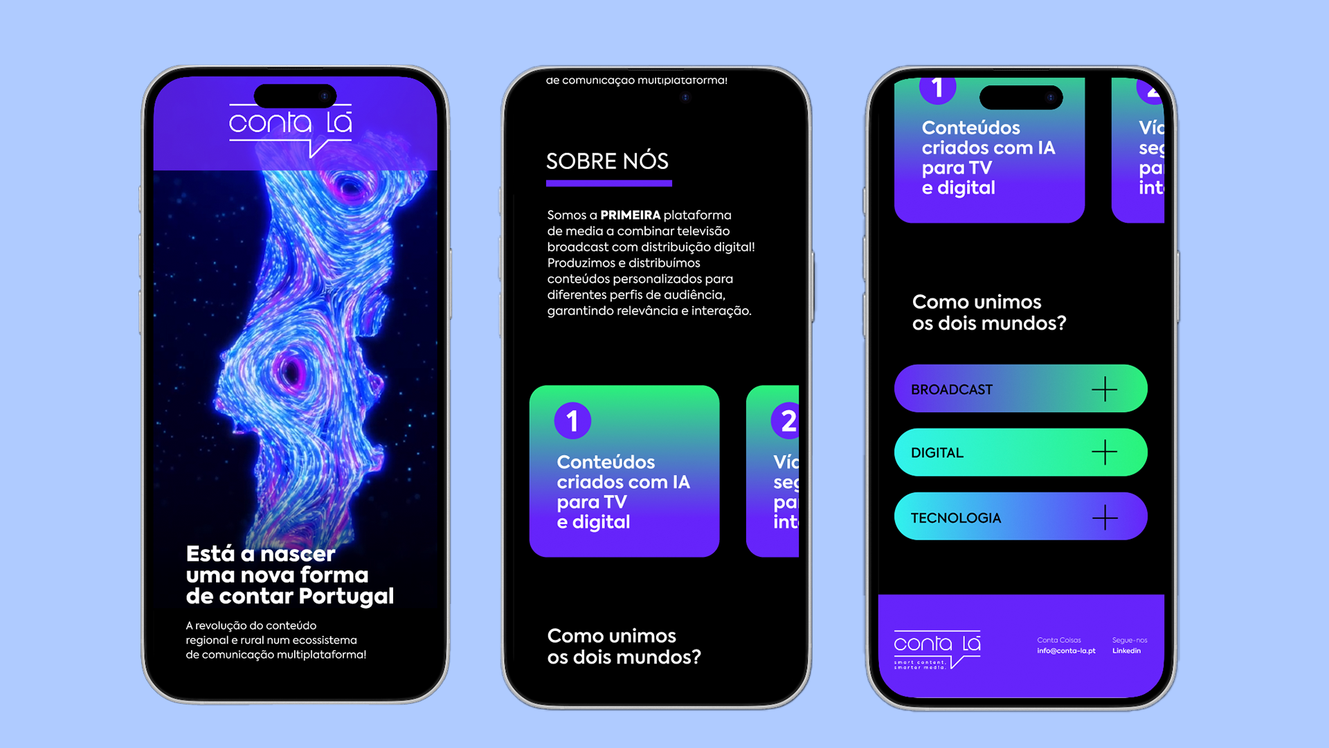
Conta Lá is a Portuguese multiplatform media channel launched in late 2025, with a mission to tell Portugal's stories from within — giving voice to regions, communities, and people often overlooked by mainstream media. Available on MEO (ch. 15), NOS (ch. 123), and Vodafone, it represents one of the most ambitious media projects in Portugal in recent years.
I was brought in to design the landing page under an urgent brief, delivering the final product in under 20 hours.
The Challenge
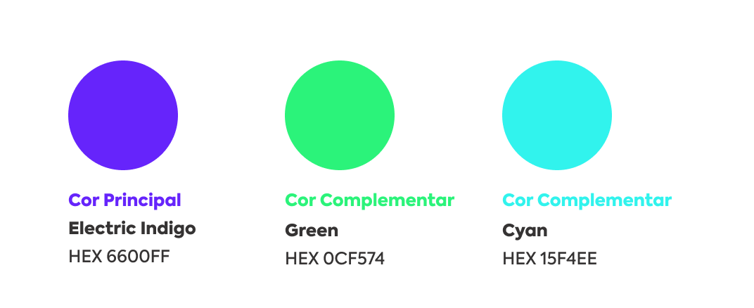
The client needed a landing page that could immediately communicate the essence of a brand-new media platform, before the channel had fully launched. A logo and colour palette were already defined. My job was to translate that identity into a compelling, functional digital experience, fast.
The constraint wasn't a limitation, it was the brief.
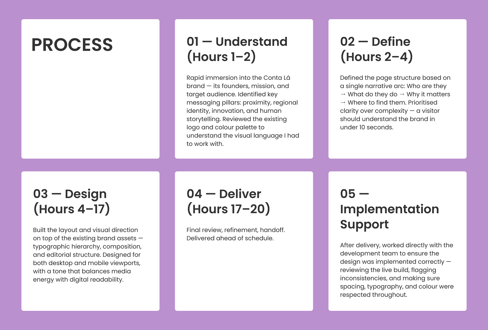
Design DecisionS
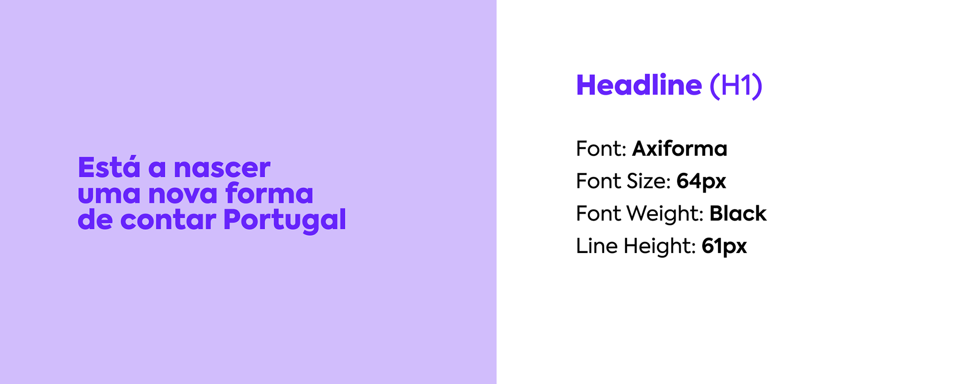
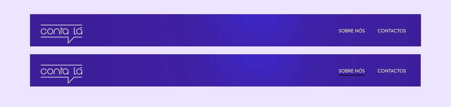
Editorial-first layout — structured like a media front page, not a generic landing page
Brand-faithful palette — worked within the existing colour system, extending it into a full digital context
Bold typography — commanding attention without losing approachability
Minimal copy, maximum clarity — every word earns its place
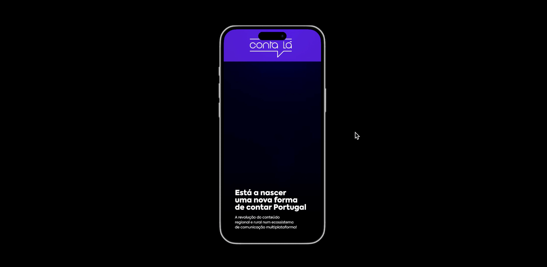
Mobile-first — the majority of Portuguese users consume media content on mobile
Outcome
Landing page delivered in under 20 hours, ready for launch day. The design helped establish the brand's digital presence during one of its most critical moments — the build-up to the 2025 autarchic elections coverage, which became Conta Lá's national debut. Beyond delivery, I stayed involved through implementation — collaborating directly with developers to ensure the final build matched the intended design with precision.
Note: The live site has since changed significantly. Following broadcast, the original colour palette was flagged as non-compliant with television standards and had to be revised. The design shown here reflects the original approved version — built on the brand's initial visual identity before those technical constraints were introduced.
What I Learned
Speed doesn't mean shortcuts. Constraints accelerate decision-making and force you to trust your instincts. This project is also a reminder that design exists within systems — broadcast standards, technical requirements, and stakeholder feedback can reshape a product after delivery. That's not failure. That's the real world.
finale prototype